Brand Project: Burberry Design Process
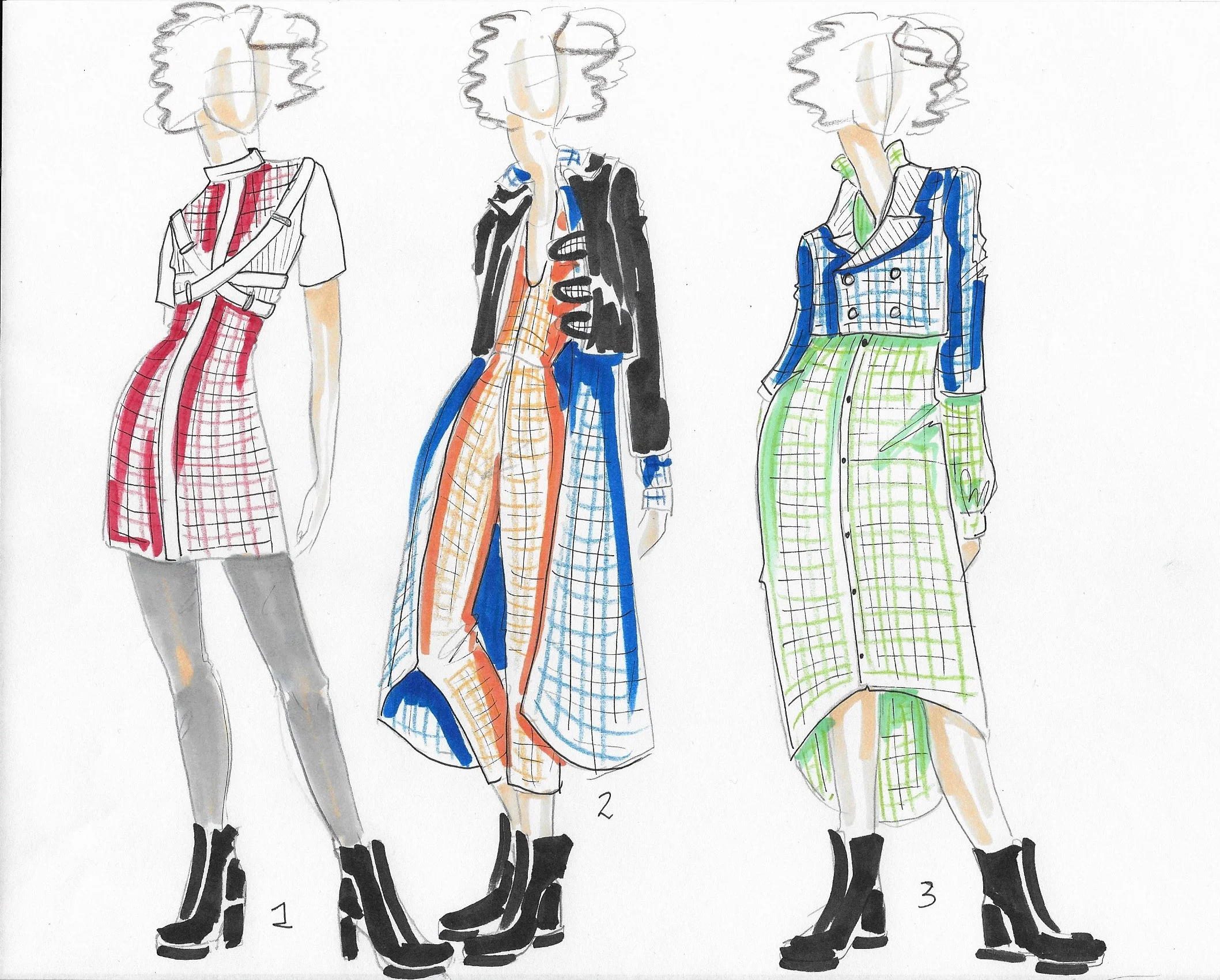
I started off my design process by trying to mix as many colors and prints that made sense. I focused mainly on the plaids as a place holder for other print designs to be mixed. As I tried to get as many ideas as possible out on paper, I started to see a trend in my designs that leaned towards a more London Punk look. I liked the idea for Burberry because the company is very classic Posh. By bringing in the punk look it easily can push the company into a younger, edgier market while still maintaining the London Aesthetic. Both the bright colors and punk style are very much out of my comfort zone; however, I found it to be a challenge I was willing to take on. I do want to work more on fabrics and prints for the final, and I have quite a few more ideas to try out.


For my preliminary line up, I wanted to bring the street style look to the collection. I found that playing with the asymmetry of garments with mixed prints made for an interesting look. I liked what was happening with the more layered looks and I think I can push that a bit further. I also can’t wait to fully render this collection. This will be a very different look than my normal illustration style which excites me. Let me know what you think and if I’m on the right track.